Sugar Sparkle: A Playful Display Font for Digital Branding
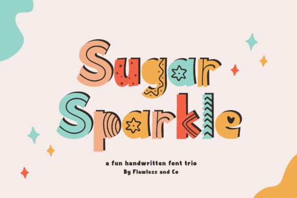
As a UI designer who ships dozens of landing pages, SaaS dashboards, and e-commerce experiences each year, I treat fonts like foundational design assets—not just decoration. Sugar Sparkle stands out because it’s a display font built for intentionality: three distinct styles—Regular, Solid, and Fun—each carrying its own expressive weight while sharing cohesive proportions, spacing, and rhythm. It’s not a script font that sacrifices legibility for flair, nor a sterile sans serif that fades into the background. It’s handwritten charm, refined for screens.
The Regular style offers clean, open letterforms with subtle bounce—ideal for hero headlines where warmth and clarity must coexist. Solid delivers confident, filled-in shapes perfect for buttons, badges, or bold section titles on light or dark backgrounds. Fun introduces patterned accents (think polka dots, zigzags, or confetti-inspired fills) that add visual delight without compromising structure. All three share consistent x-heights and generous counters—critical for readability at 32px and above on desktop, and surprisingly effective down to 28px on mobile viewports when used sparingly.
In practice, Sugar Sparkle thrives where tone meets conversion. On a boutique skincare brand’s homepage, I’ve used the Regular style for the hero headline (“Glow Starts Here”) over a soft gradient—immediately signaling approachability and care. The Solid variant anchors the primary CTA button (“Get Your Glow Kit”), creating contrast against a neutral sans serif body font. That small shift in weight and texture boosts click-through by anchoring emotional resonance to action. For a children’s learning app, the Fun style appears in animated section dividers and milestone badges—never in paragraph text, but always reinforcing playfulness and progress.
It’s vital to recognize what Sugar Sparkle isn’t designed for: body copy, dense product descriptions, or long-form blog posts. As a display font, its strength lies in hierarchy—not volume. Use it for short, high-impact phrases: logo lockups, testimonial highlights, course module titles, email subject lines, social media banners, or packaging mockups embedded in web previews. Its personality shines brightest when paired with a highly legible companion—like Inter, Manrope, or Source Sans Pro—for all supporting text. That pairing creates breathing room, establishes trust through contrast, and keeps users focused on content—not font gymnastics.
On responsive layouts, test Sugar Sparkle across breakpoints early. At 480px width, I default to Regular or Solid only—and cap usage to one instance per screen (e.g., the H1 or a single CTA). Avoid Fun style on mobile unless it’s isolated as a decorative SVG icon or static graphic, since pattern density can blur on low-DPI displays. For dark mode, Solid often performs best—its mass holds up against deep backgrounds without requiring extra text shadow or stroke. Over imagery? Stick to Regular with a subtle semi-transparent overlay or soft drop shadow (2px blur, 0.7 opacity) to ensure contrast passes WCAG AA standards.
Brand identity consistency is where Sugar Sparkle earns long-term value. When applied across a digital brand kit—website headers, Notion course templates, Canva social posts, Figma design systems—it becomes a recognizable tonal signature. A coaching business might use Fun style only for “You’re Ready” celebration banners, while keeping Regular for all service headings. That restraint makes the font feel intentional, not chaotic. And because all three styles share identical metrics and kerning pairs, switching between them mid-project doesn’t break layout grids or require reflow adjustments.
Technically, Sugar Sparkle ships as WOFF2 and WOFF for optimal web delivery, includes OpenType features like stylistic alternates and ligatures, and supports Latin-based languages (including extended diacritics for French, Spanish, and Portuguese). No variable axis—but the three discrete styles offer enough expressive range without sacrificing load performance. There are no condensed or italic variants, which is deliberate: this is a display font, not a text system. If your project needs multilingual support beyond Western European languages, verify glyph coverage before licensing.
Licensing matters—especially for client work. Sugar Sparkle is a commercial font, and its license covers web embedding via @font-face, use in SaaS interfaces, digital templates sold on marketplaces, and online store banners. It does not cover redistribution (e.g., bundling in a WordPress theme for resale) or server-side rendering of dynamic text unless explicitly permitted. For agencies, I recommend purchasing an extended license upfront—it avoids last-minute compliance checks before launch and ensures smooth handoff to developers integrating via Google Fonts alternatives or self-hosted CSS.
Pairing suggestions go beyond aesthetics—they’re usability decisions. Combine Sugar Sparkle Regular with a warm, humanist sans serif like Nunito or Poppins for lifestyle brands. Pair Solid with a sturdy geometric typeface like Montserrat for tech-adjacent startups wanting friendlier authority. For editorial or creative portfolio sites, try Sugar Sparkle Fun alongside a crisp serif like Literata or Lora—where the contrast between playful display and structured body text signals both creativity and credibility.
Ultimately, Sugar Sparkle works because it respects the constraints of digital space while delivering unmistakable character. It doesn’t ask you to choose between personality and professionalism—it gives you both, in a format built for real-world UI constraints: fast loading, responsive scaling, accessible contrast, and scalable brand expression. Whether you’re designing a one-page product launch, refreshing a Shopify theme, or building a digital course platform, this display font earns its place—not as ornament, but as voice.