Dotdot: A Display Font That Makes Your Headlines Instantly Clickable
It’s 9:47 a.m. on launch day — and I’m squinting at my phone screen, refreshing Instagram previews for the third time. The campaign is live in six hours. Everything’s locked: copy, color palette, asset dimensions. But something feels off about the teaser graphic for our new workshop series. The headline reads “Your First Real Breakthrough Starts Here” — strong message, right? Yet it blends into the background instead of punching through.
That’s when I open my fonts folder and pull up Dotdot.
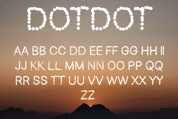
Not as a last-minute stunt — but as a deliberate visual reset. Dotdot isn’t subtle. It’s a display font with personality: rounded terminals, playful dot accents on letters like “i”, “j”, and “l”, and just enough irregularity to feel human without sacrificing legibility. It’s cheerful but not childish, bold but not aggressive — like a confident presenter who smiles while making a serious point. Its rhythm invites pause. Its shape commands attention — especially in fast-scrolling feeds where milliseconds decide whether someone stops or swipes.
I drop Dotdot onto the headline. Suddenly, “Breakthrough” pops — not because it’s bigger, but because the font gives each word its own expressive weight. The dots act like tiny visual anchors. The curves soften the urgency without dulling it. And yes — it still works at 28px on mobile. (I checked. Twice.)
This is where Dotdot earns its place in real campaign workflows: not as decoration, but as strategic emphasis. It’s built for moments when you need people to see before they read — on YouTube thumbnails, Pinterest pins, email banners, or Instagram Reels covers. In those spaces, clarity isn’t just about contrast or size; it’s about typeface psychology. Dotdot signals approachability, creativity, and intention — all without saying a word.
Here’s how it showed up across our campaign assets:
- YouTube thumbnails: Used for short, action-driven labels like “FREE TOOLKIT” or “WATCH NOW” — always over a high-contrast background (dark text on light, or vice versa). The rounded shapes hold up even when scaled down to thumbnail size.
- Instagram carousel headers: Paired with a clean sans serif (we used Inter) for body text. Dotdot handled slide titles only — never paragraphs, never captions. It kept hierarchy clear and scrolling intuitive.
- Pinterest pins: Applied to quote graphics and value-driven hooks (“5 Minutes to Clarity”, “No Experience Needed”). Its friendly tone aligned perfectly with the platform’s aspirational-but-relatable vibe.
- Email banners: Sized at 42px on desktop, 32px on mobile — tight tracking, no letter-spacing needed. The dots remained visible and consistent across iOS and Android clients.
- Landing page hero headers: Used sparingly — only for the primary H1. Never for subheads or CTAs. Let the font breathe. Let it mean something.
Dotdot shines brightest in short-form, high-impact contexts: sale announcements (“SUMMER FLASH”), webinar banners (“JOIN THE WAITLIST”), product teasers (“COMING JULY”), or branded content series labels (“WEEKLY INSIGHTS”). It’s not meant for long blocks of text, fine print, or legal disclaimers — and that’s by design. As a display font, its job is to set tone, reinforce memory, and create instant recognition. Think of it like a signature move — distinct, repeatable, and unmistakably yours.
Readability in small spaces? Dotdot delivers — if you respect its role. On dark backgrounds, we used a crisp white with slight stroke (1px) for extra pop. On light backgrounds, a deep charcoal (#2D2D2D) maintained warmth without fading. No shadow effects. No heavy outlines. Just smart contrast and intentional sizing. And crucially: we tested every variation on actual devices — not just desktop previews — because what looks sharp at 100% zoom rarely survives a thumb-scroll.
Pairing Dotdot is intuitive, not complicated. We matched it with Inter for nearly everything — a neutral, highly legible sans serif that lets Dotdot lead without competing. For more editorial moments (like blog headers or newsletter intros), we tried pairing with a warm serif (Cormorant Garamond), letting Dotdot handle the title and the serif carry the byline. Never paired it with another playful font — that’s visual noise, not harmony. And we avoided script or handwritten fonts directly beside it; the contrast felt jarring, not complementary.
Before dropping Dotdot into client templates or ad sets, we double-checked the file package: full OpenType support, standard weights (Regular, Bold), stylistic alternates (including dotted vs. solid i/j variants), and multilingual glyphs covering Western European languages. Licensing was commercial — critical for digital ads, Shopify banners, and downloadable lead magnets. No surprises. No last-minute swaps.
What surprised us most wasn’t how well Dotdot worked — it’s designed to — but how consistently it elevated *tone*. Not just “fun” or “quirky”, but *confidently human*. In a feed saturated with polished AI visuals and ultra-minimalist fonts, Dotdot became our quiet differentiator. Not loud. Not gimmicky. Just unmistakably present.
So next time you’re tweaking that thumbnail, adjusting that banner, or prepping a week’s worth of social posts — ask yourself: does this headline need to be understood? Or does it need to be felt? If the answer leans toward the latter, Dotdot isn’t just an option. It’s your next strategic type choice.